osume
contemporary and minimalist. conceptualizing and nurturing a brand, from start to finish.
brand name
the culture of minimalism is heavily influenced by the japanese aesthetic. the name 'osume' represents an influence of japanese design.
the word osume playfully combines 'osu' (press) and me to form the meaning of 'press me'. a fusion of japanese and english.
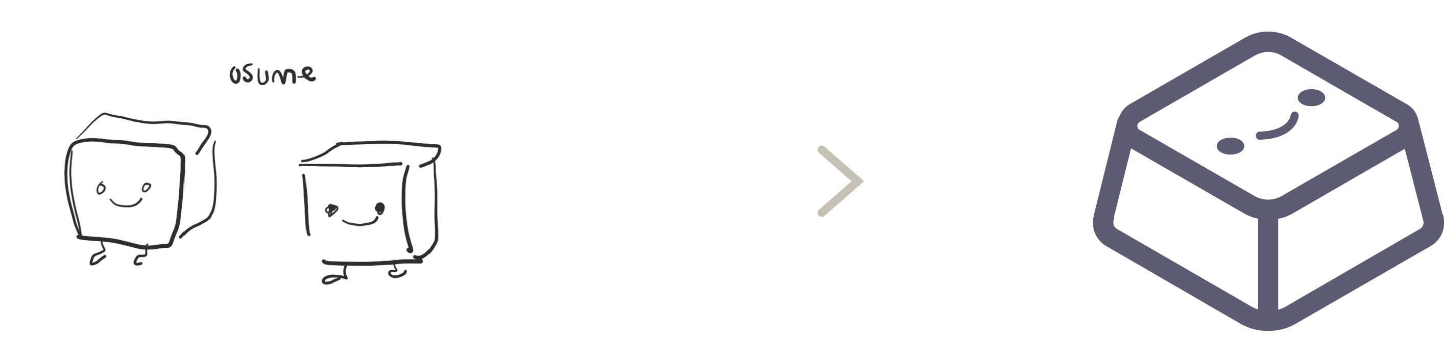
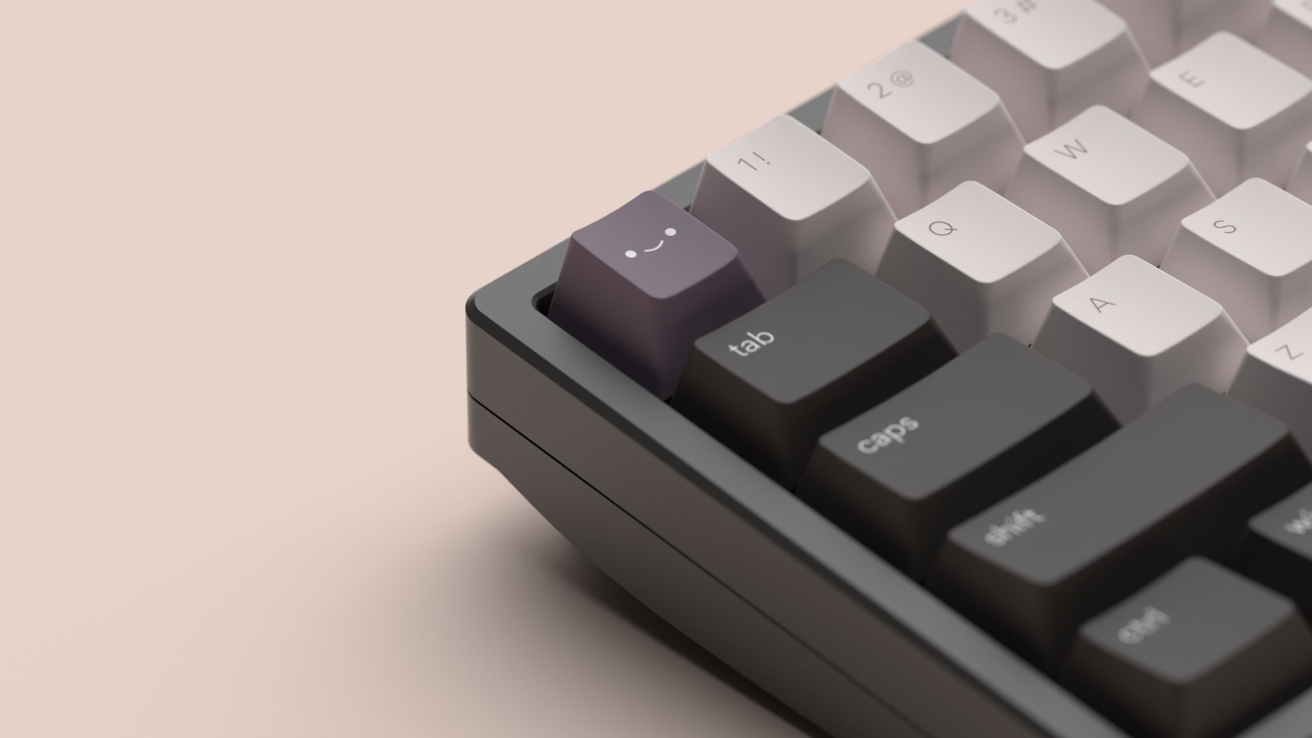
logo
the isometric logo, resembling a keycap, is designed to be recognizable, simple, sophisticated yet cute.
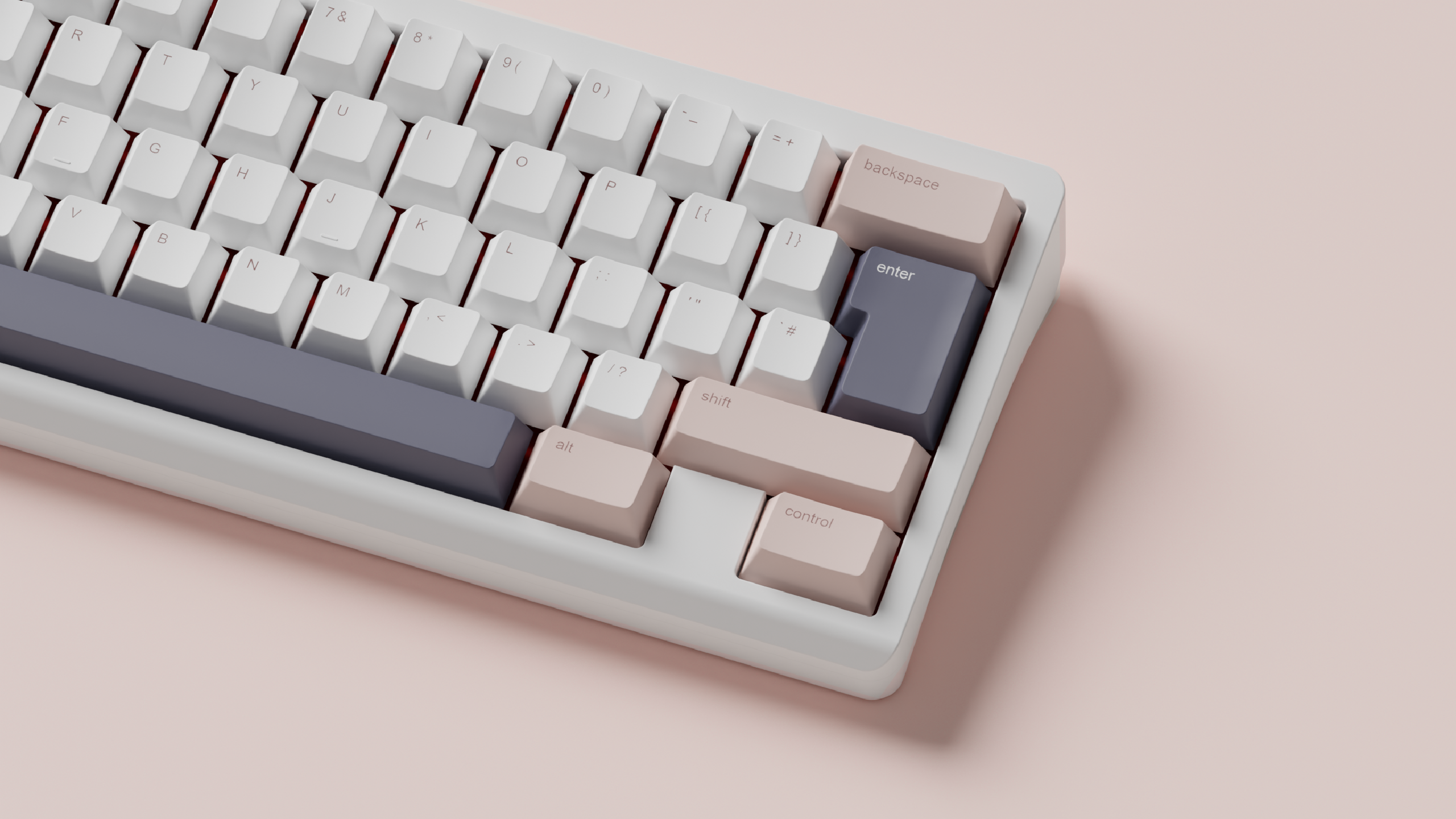
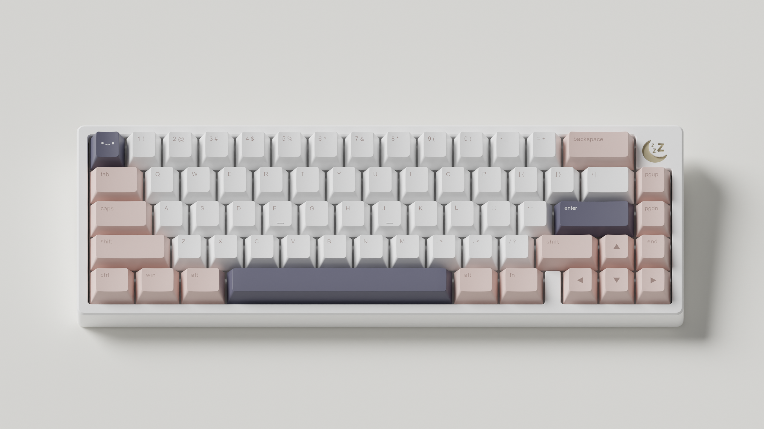
brand colours

the colours chosen complement the brand. they utilize muted and variations of pastel. the dusty blue colour helps to offset the overly soft aesthetic, helping the brand cater and appeal to a wider demographic.
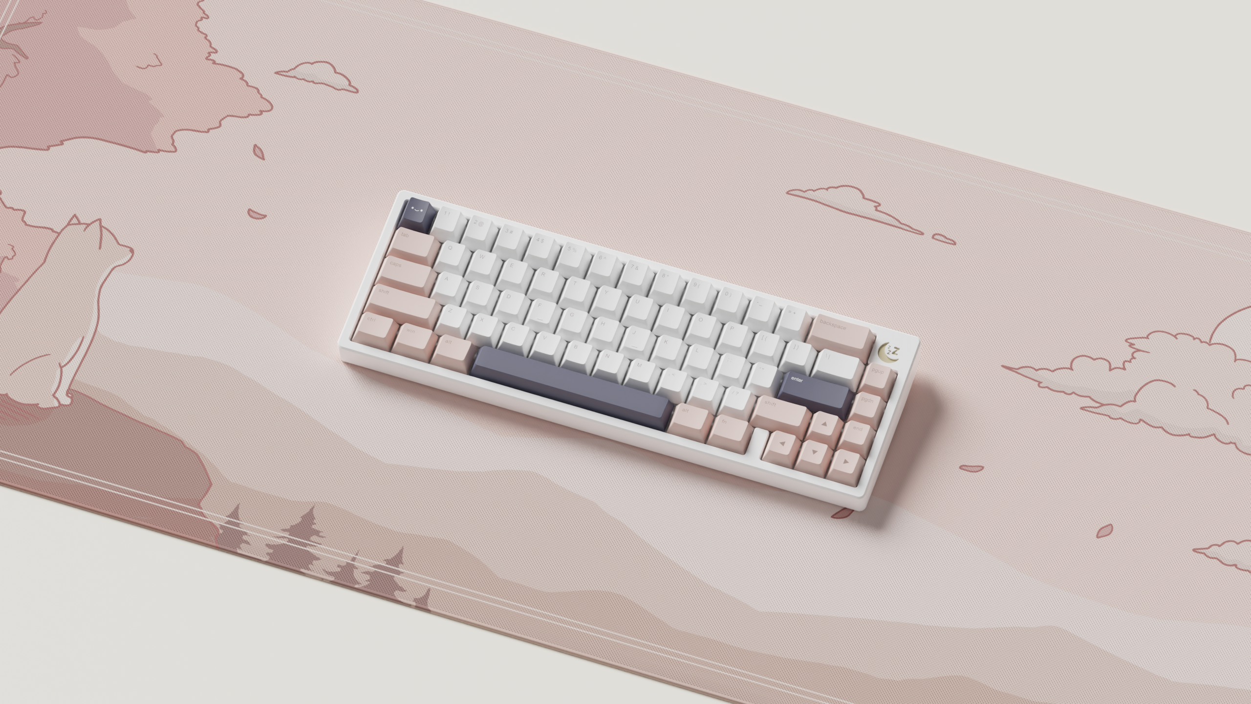
product design
the original design of the keycaps break trends/norms within the keycap industry. many custom keycap brands use large bold typefaces mixed with iconography- I wanted to focus on simple and elegant typography for a more sophisticated workspace aesthetic.
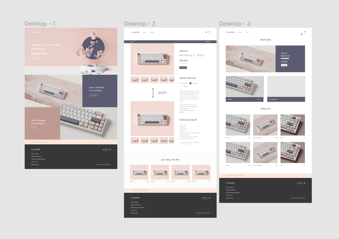
website
taking into consideration the brand identity, the website had to reflect this as well. designed in figma, the website features elegant use of brand colours and typography, as well as a natural userflow that helps users find the products they need, easily and quickly.